
Interview Mate
"New Interactive System in Interview Practice for Students"
Students want to get a dream job. Interview skills are one of the most important factors to get the job they want. However, students don't spend as much time presenting themselves compared to the time they spend studying. In this project, I'll propose a new system to encourage students to practice interviewing in an effective way.
Course
UX Design Strategies (VCDE 737)
Timeline / Year
6 week / 2019
Domain
Education
Role: Personal Project
Research, Illustration, Visual Design, Animation
Tool
Illustrator, Figma, Principle, After Effects, Premiere
PROBLEM
Students spend a tremendous amount of time studying in college BUT don't spend as much time practicing the interview which presents their soft skills to employers.
SOLUTION
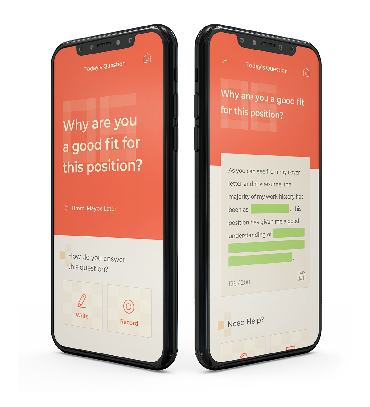
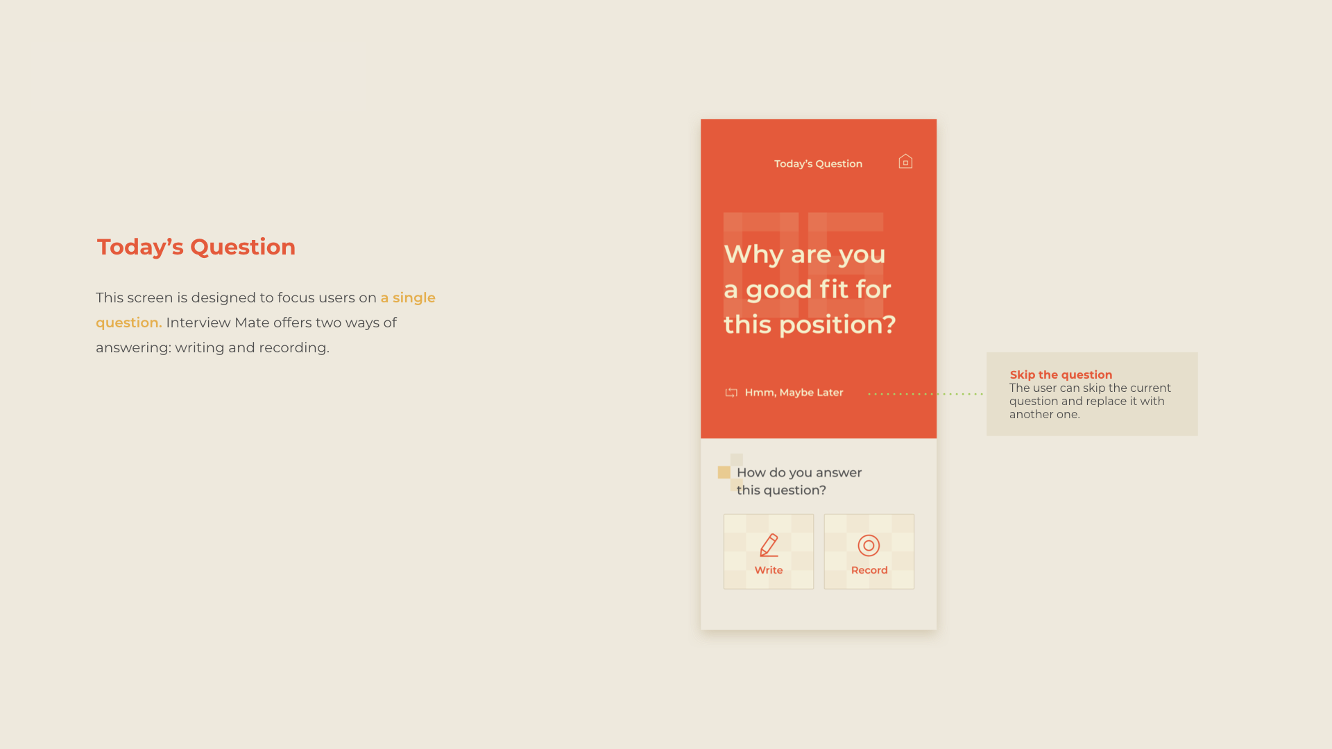
Create the app which asks one question daily and gives some feedback with fun interaction, which makes students feel like they solve a simple task every day.
OBJECTIVES
One Daily Question
The app asks students one question per day which is frequently asked in interviews.
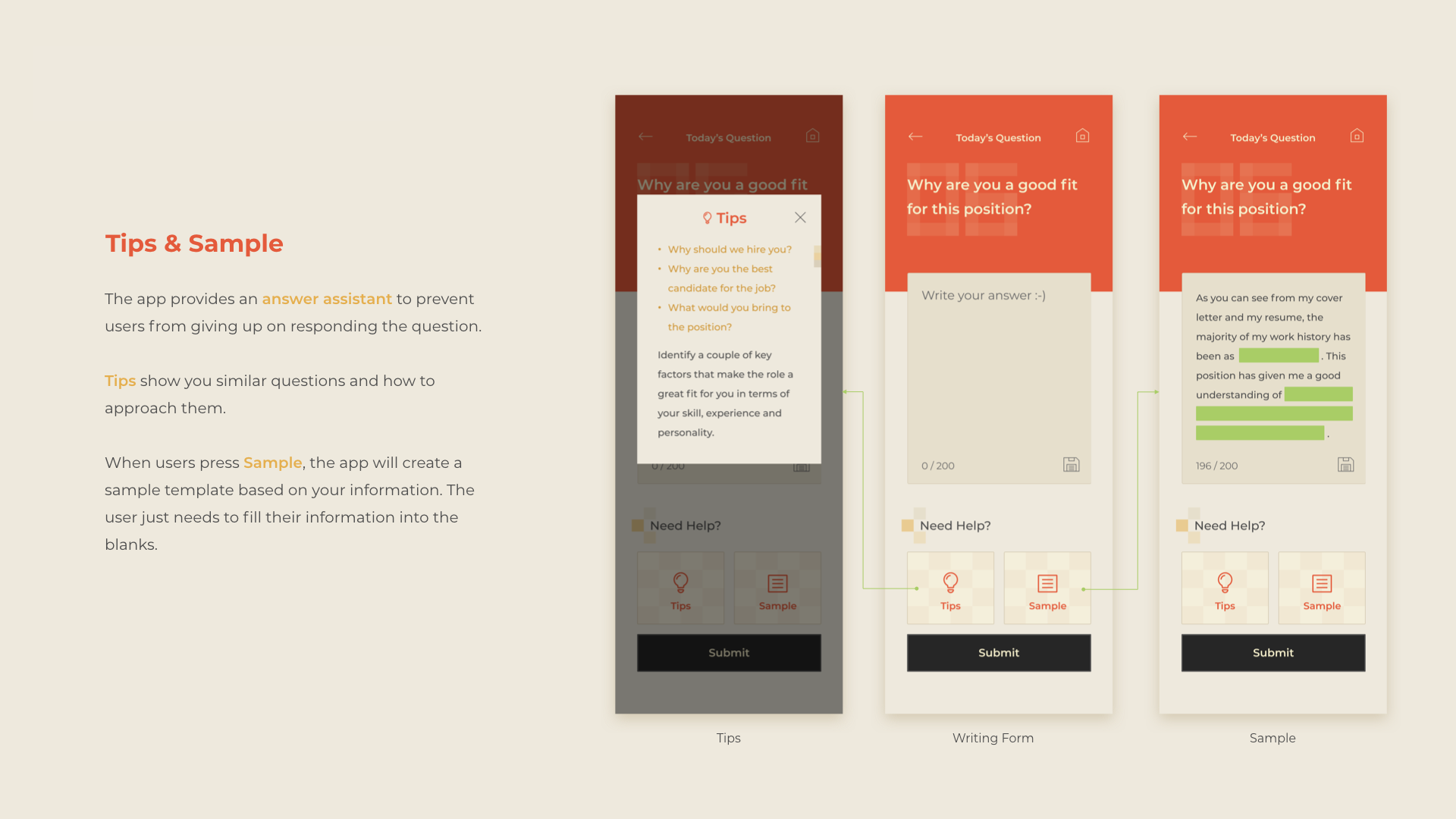
Answer Assistant
Provides tips and template answers based on the user’s information so that they can improve their future answers.
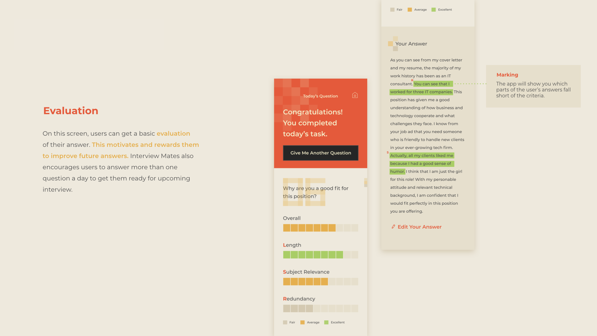
Useful Evaluation
Motivates and rewards users by evaluating their responses and encouraging them to prepare a better answer in the future.
DIVING DEEPER
17 hours per week
to preparing for class
It usually takes 4 years for a college student to get
a bachelor's degree. During that time, the average student spends about 17 hours each week preparing for classes according to the National Survey of Student Engagement’s findings. However, students don’t spend as much time practicing interviews which is an important process to present them to employers.
10,000 hours
to master public speaking
A study shows that it takes about 10,000 hours of deliberate practice to master public speaking. Of course, students don't have to spend that much time for interviews, but at least it seems certain that a lot of practice is needed to achieve good results in interviews.
There are 3 WAYS students usually practice their interview skills. However, these prevent students from continuing to practice interviews because of some shortcomings. Users need a new interactive system that can easily start, be organized, and evaluated in the interview exercise.

Memorization
Easy to start
BUT
Hard to review
Not organized

Documentation
Organized
BUT
Boring
Time consuming

Consultant
Immediate feedback
BUT
Not always available
Expensive
USER STORY

International Student
Since English is not my native language, I want to prepare every possible answer and practice repeatedly until I become fluent.

Bad Public Speaker
Because I’m a bad speaker, I need
good tips and feedback to prepare
my answers.

Urgent Job Seeker
I have a scheduled interview and I don’t have much time to prepare all list of possible questions. I wish I had a good template.
VISUAL EXPLORATION
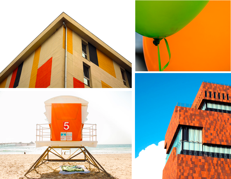
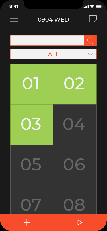
I had two explorations for visual design. I got inspiration from the way how students memorize something important: sticky note and book note style. I chose the post-it style because I believed the vivid color and simple layout attract more users.
1. Sticky Note Style
Vivid Warm Welcoming Square Flat
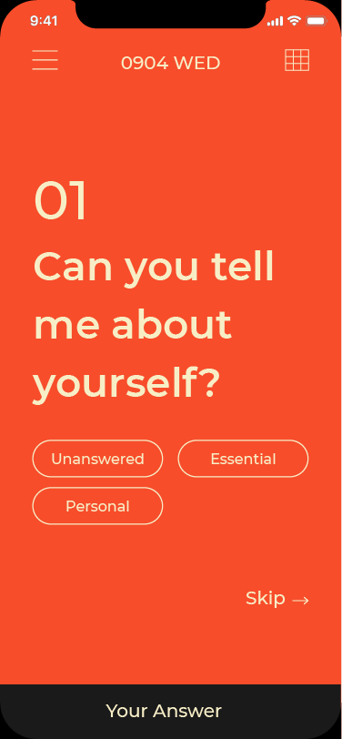
Today's Question
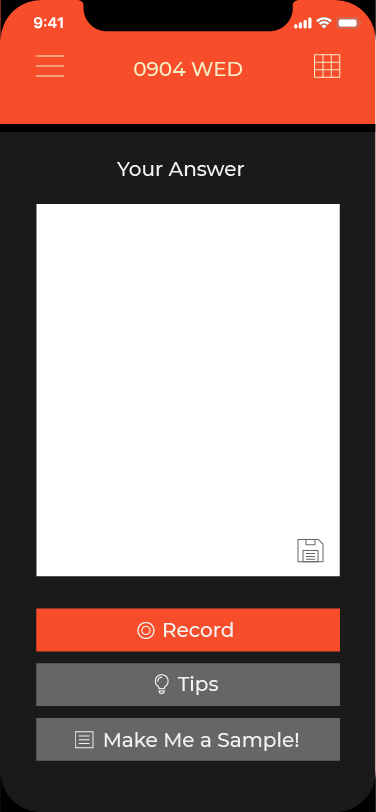
Writing Form
Test Mode
2. Book Note Style
Soft Comfortable Clean Round Shadow

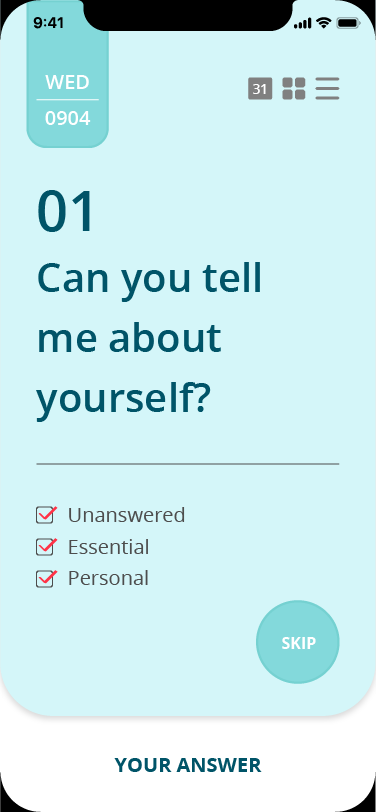
Today's Question
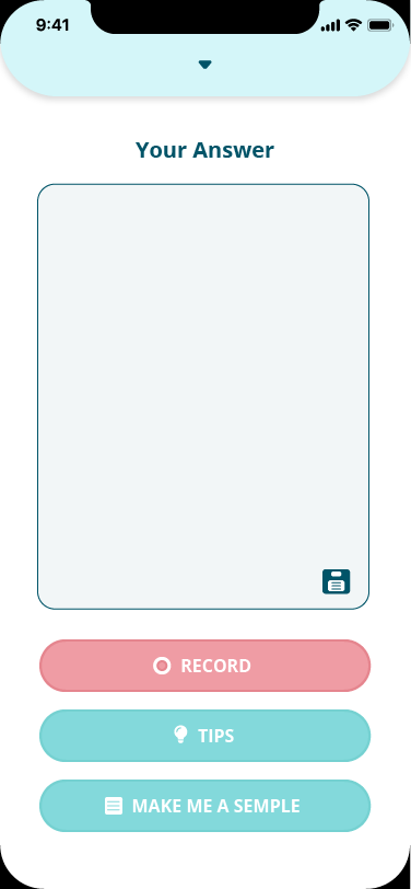
Writing Form
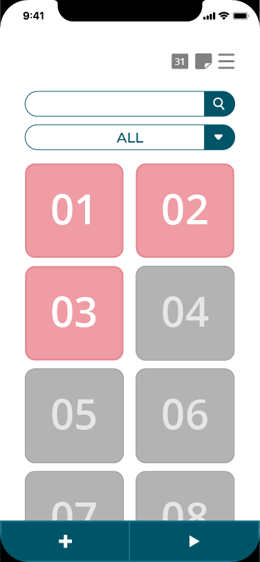
Test Mode
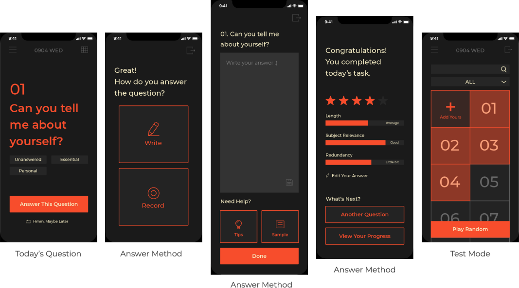
ITERATION 1_ Unify Colors
I thought the original screens don’t have design consistency with each other so I applied a dark background and only picked the orange as a point color. I also expected that the black background makes users focus on the task than the original one. I gave up this design style because of the following issues:
- Don’t have any branding
- Don’t convey the inviting feeling
to users
ITERATION 2_ BRANDING
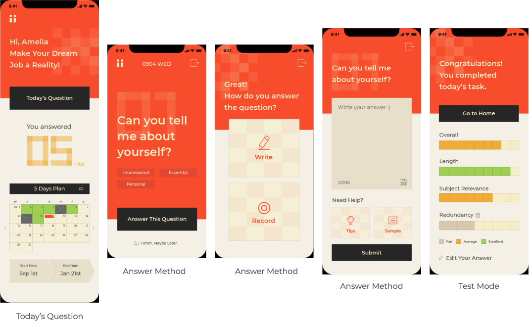
This design was carried out with the concept of orange color and transparent card. The key changes from this design to the final are:
- Added recent answer section to
the home page for the user’s convenient review. - Changed calendar and evaluation bar style to match with other design components.
- Added the answer that users wrote on the evaluation screen and marked which part is the problem.
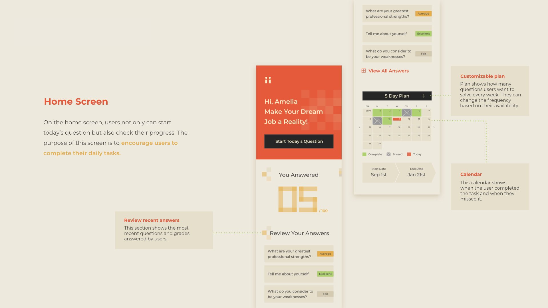
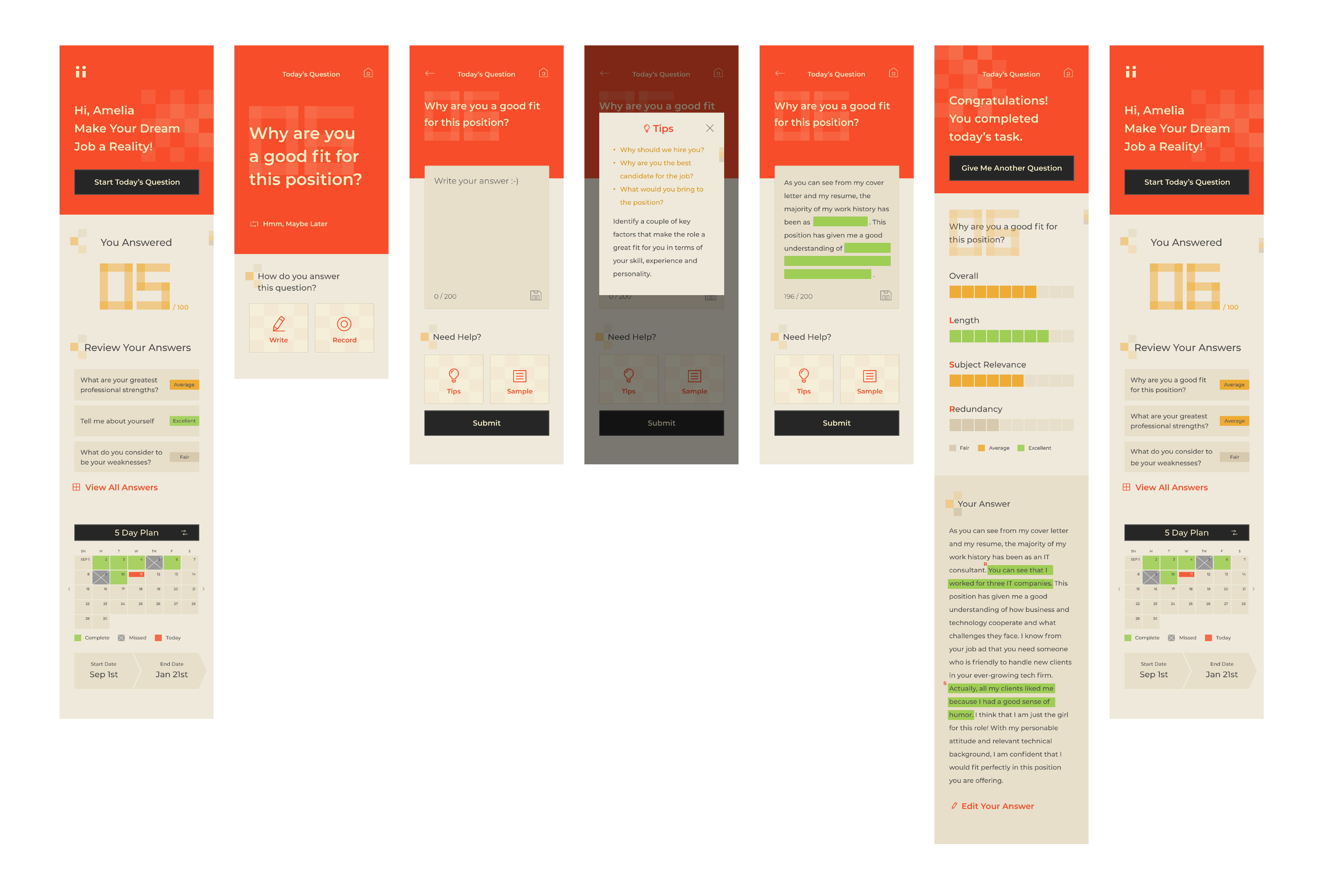
SCREEN BREAKDOWN
← Swipe the page →
FINAL DESIGN
CONCLUSION
Interview Mate proposes a new interactive system for how students practice interviews. One daily question, hint and evaluation will help students continue their interview practice.
With Interview Mate, I expect students to be skilled and well-practiced so that they can be confident in any kind of interview.
Stay in touch
© 2021 Haena Lee
