Wine Sense
RIT Visual Communication Design had a project with Total Wine & More that is America’s largest independent wine retailer. Out of the two prompts they gave, each student chose one and created a digital product. Wine Sense is a smart, interactive and sharable universal wine tasting survey app.
Project Type
School/Solo Project
Client
Total Wine & More
Duration / Year
8 weeks / 2019
Domain
Wine Tasting
Tool
Figma, Illustrator, Photoshop, Principle, After Effect
Prompt
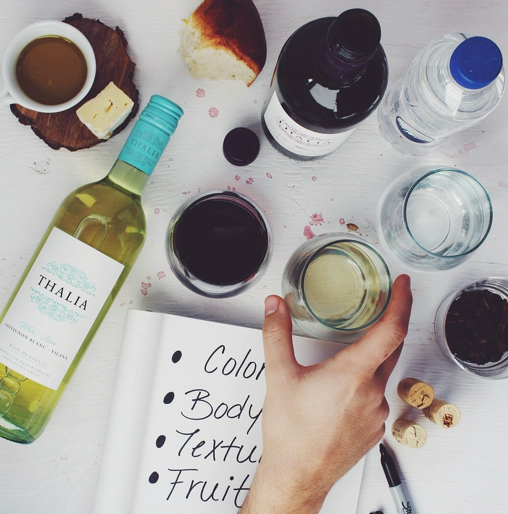
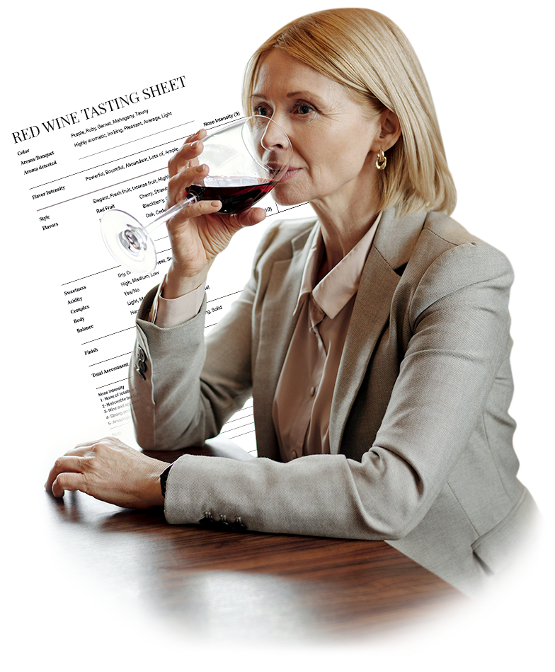
Wine Tastings still rely heavily on memory or paper and don’t leverage digital well so there's a high risk of being forgotten or lost once the event is over.
Problem
Users have difficulty keeping track of wine tasting records and taking meaningful information from them, which prevents users from moving forward to a better wine experience.
Solution
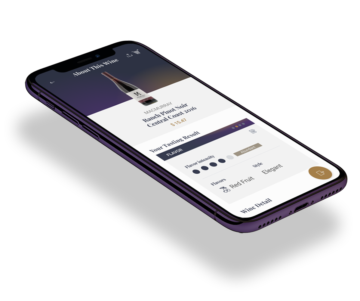
Create an interactive universal survey app that records users' wine preferences in realtime and shares the tasting experience with others.
Objectives
Stimulate Sense
Fun and intuitive interaction help users to use most of their senses and taste without boredom.
Taste Smart
The app provides useful information and recommended products that broaden the user’s wine experience based on their survey records.
Enjoy Together
With the group and sharing function, the user can enjoy their good wine experience with their loved one.
How It works
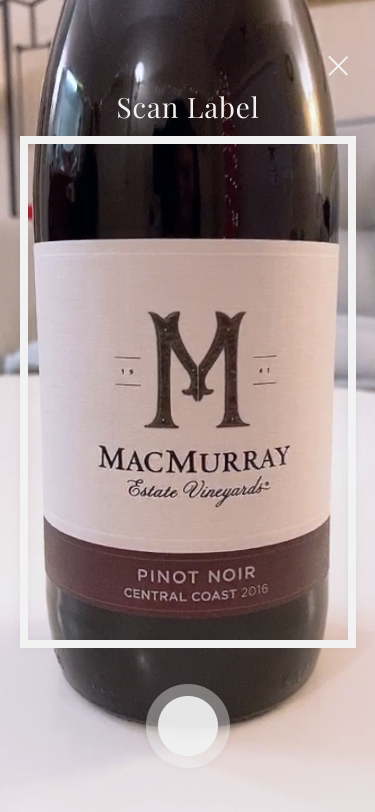
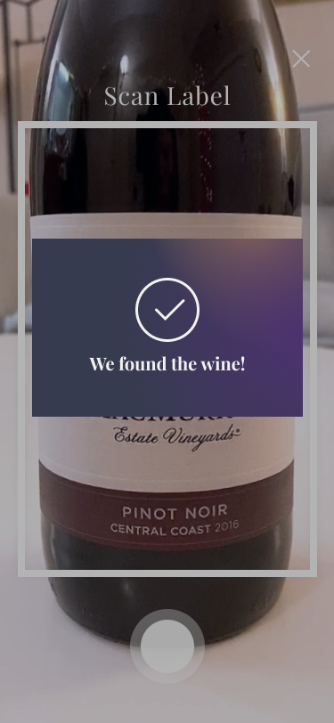
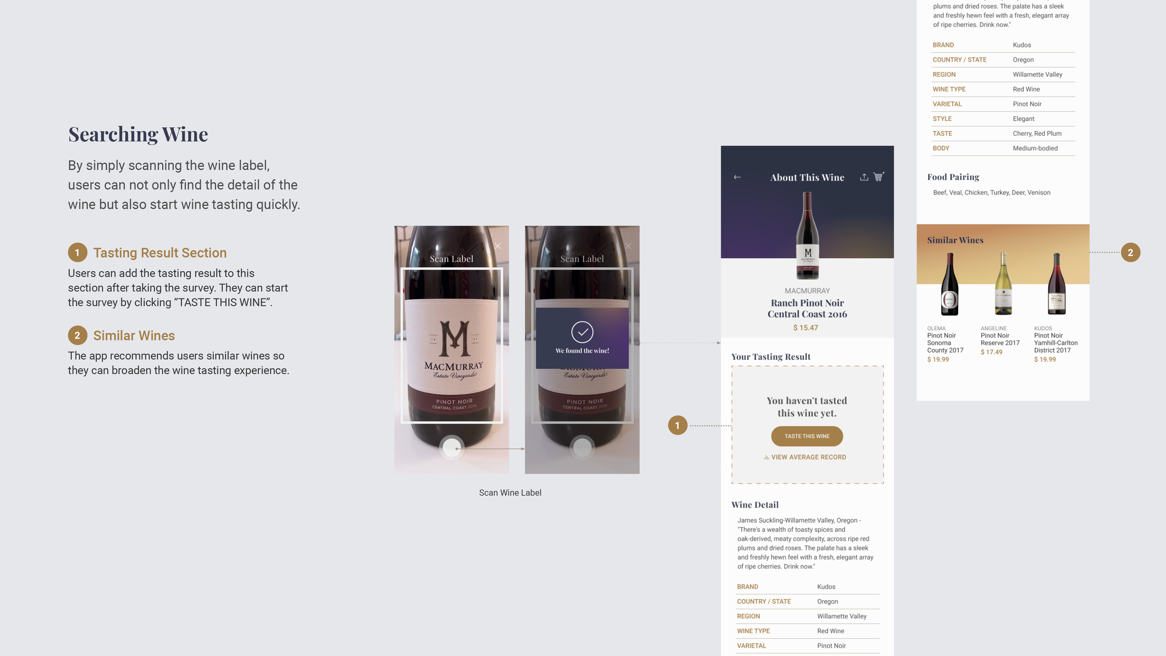
Step 1. Scan wine label
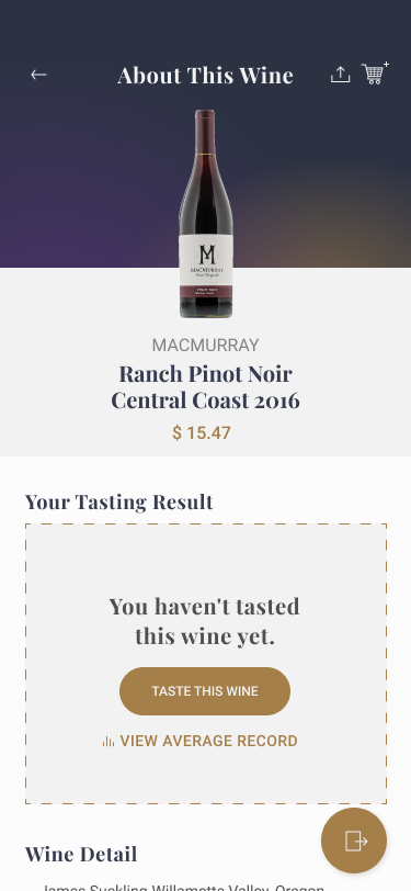
By simply scanning the wine label, the user can easily get the wine information and start wine tasting.
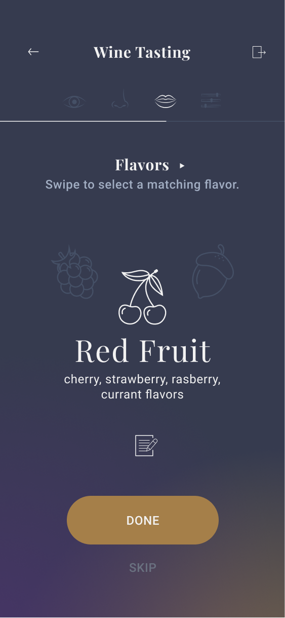
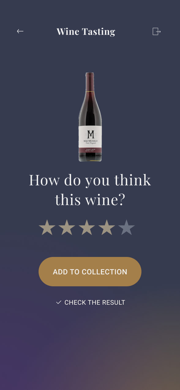
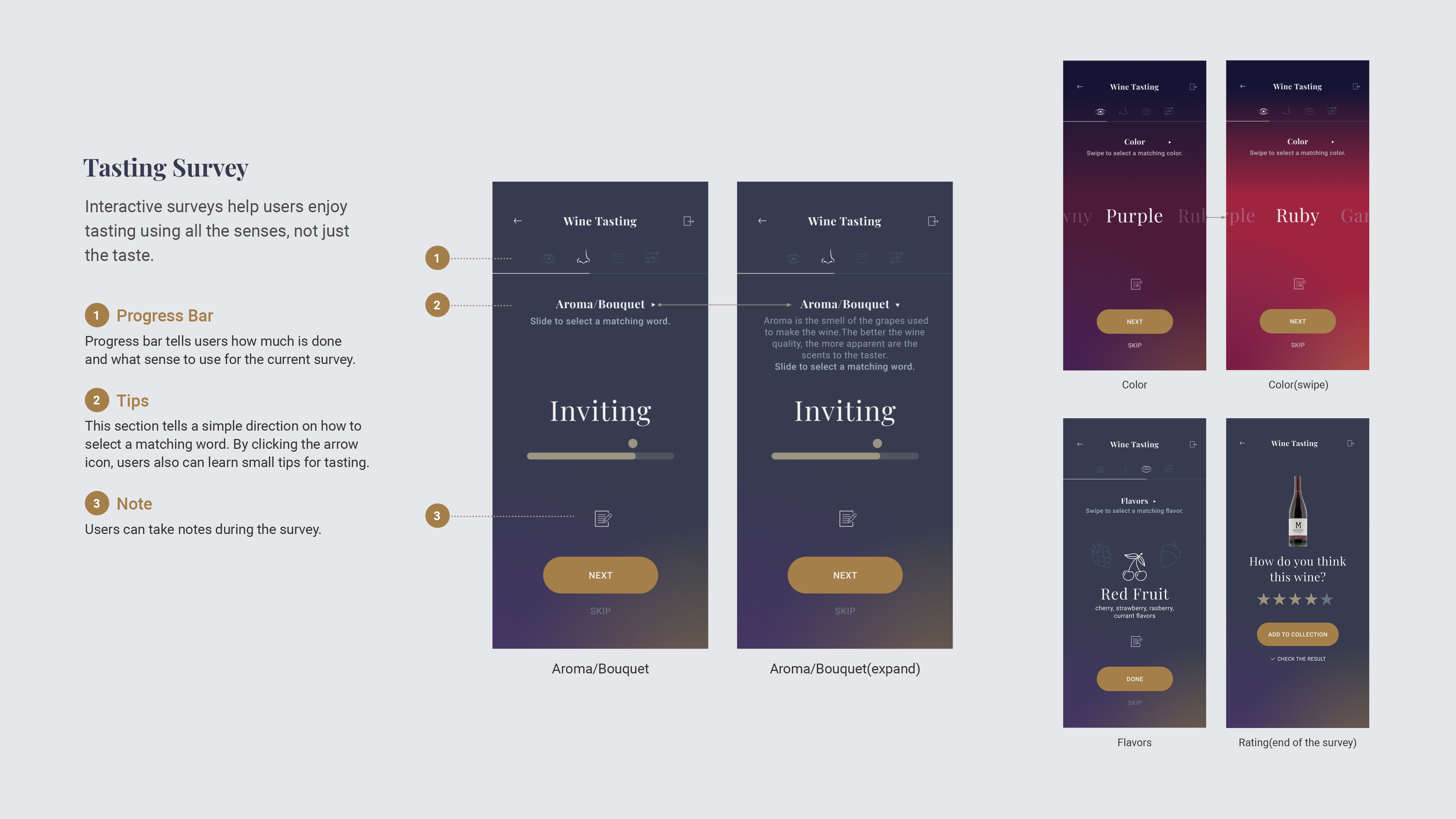
Step 2. Start wine testing survey
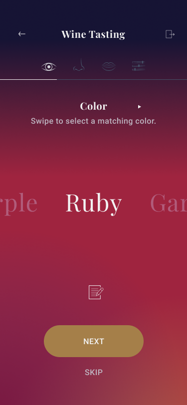
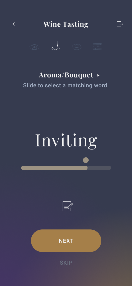
The user can record tasting results by following step-by-step instructions. Single focus questions are designed with simple and intuitive interaction to enhance their tasting experience.
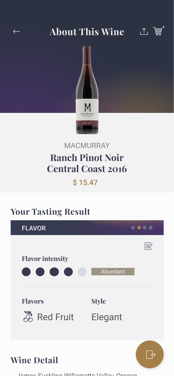
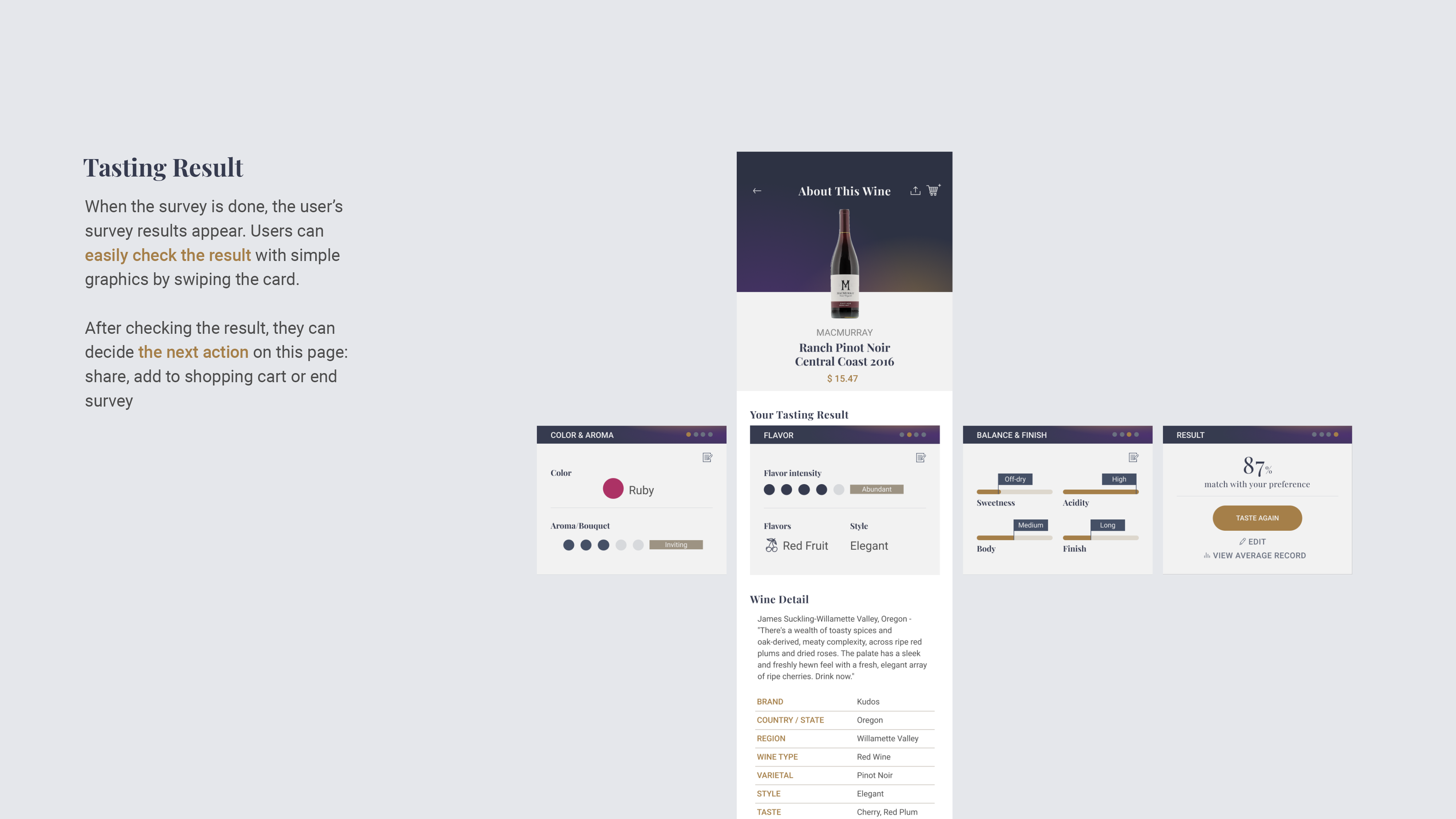
Step 3. Check wine testing result
After the survey end, the result card is added to the wine information page. Based on the result, the user can easily check that the wine matches their preference.
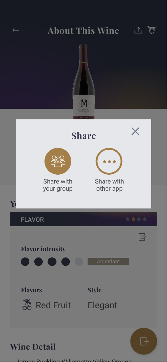
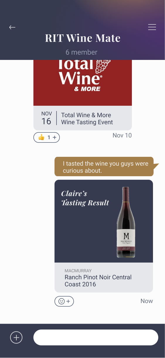
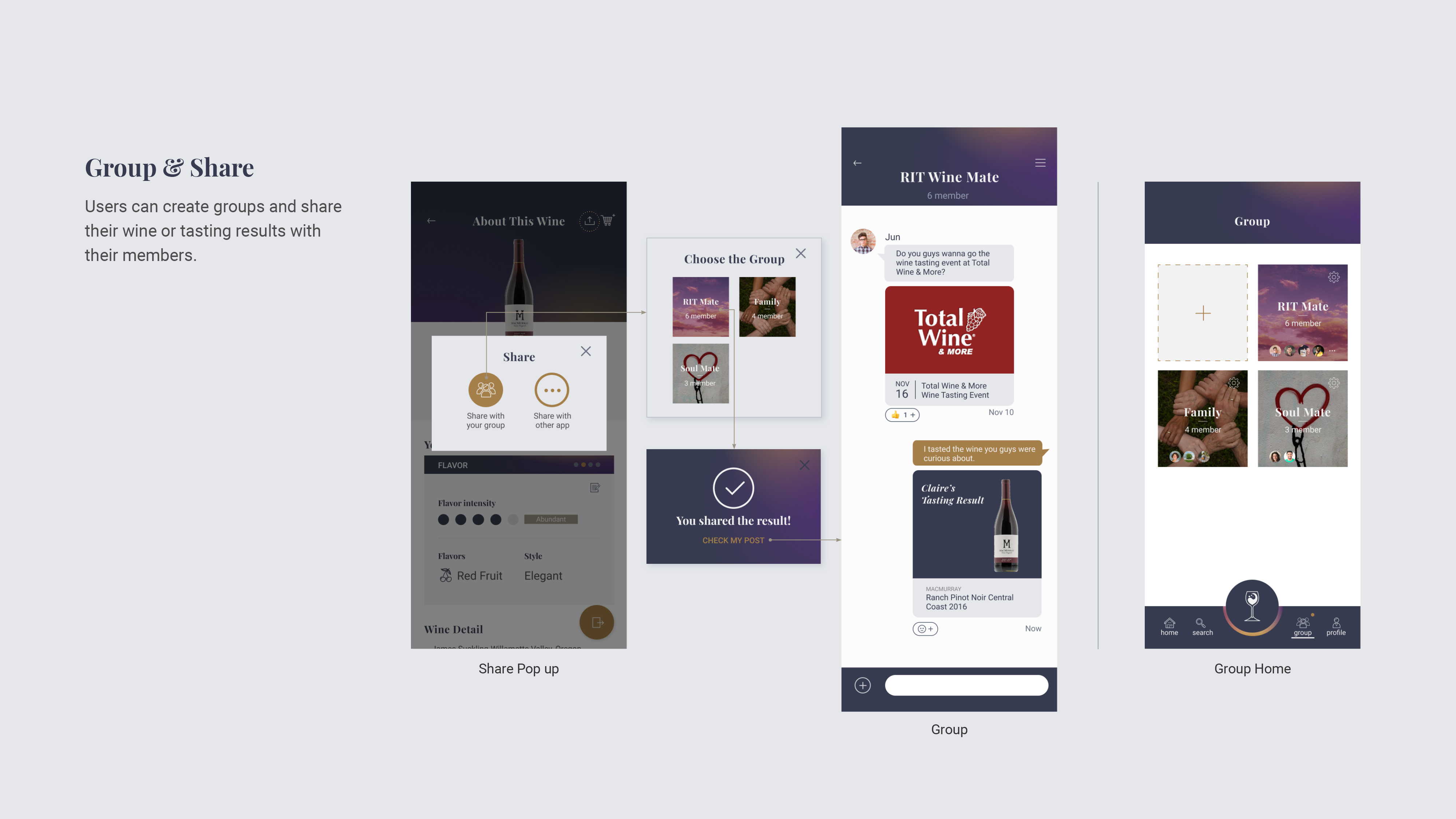
Step 4. Share your experience
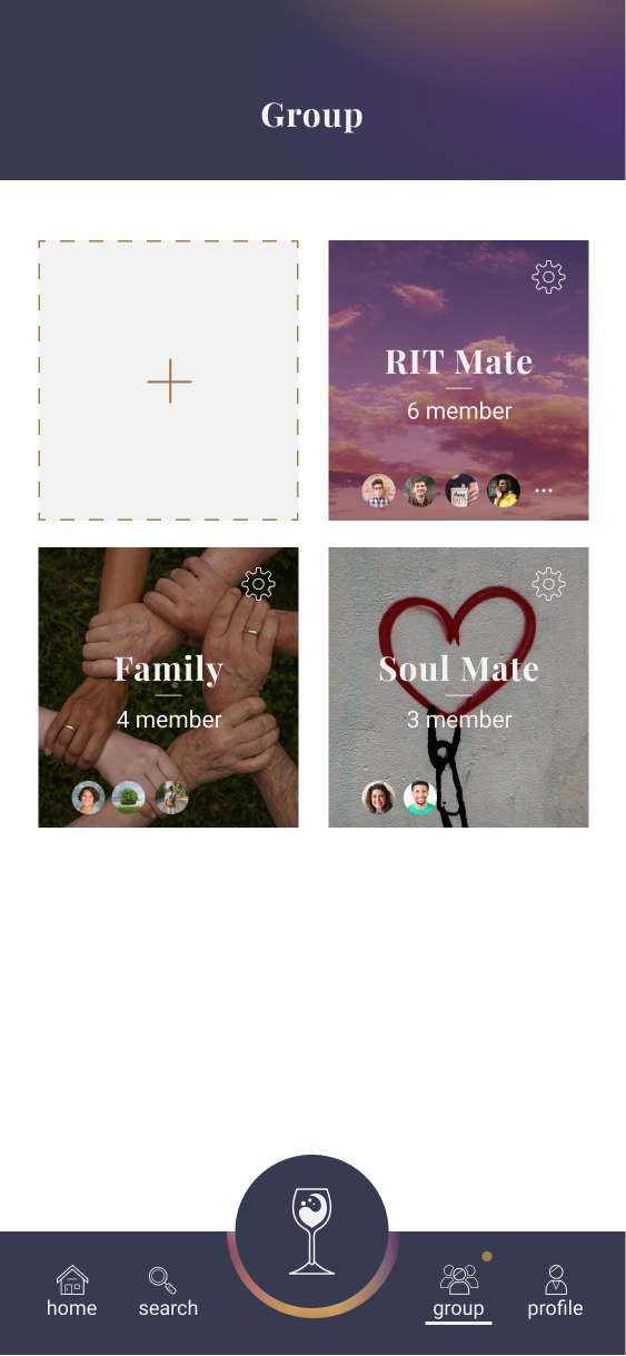
The user can create groups with their friends and family and share their wine experience.
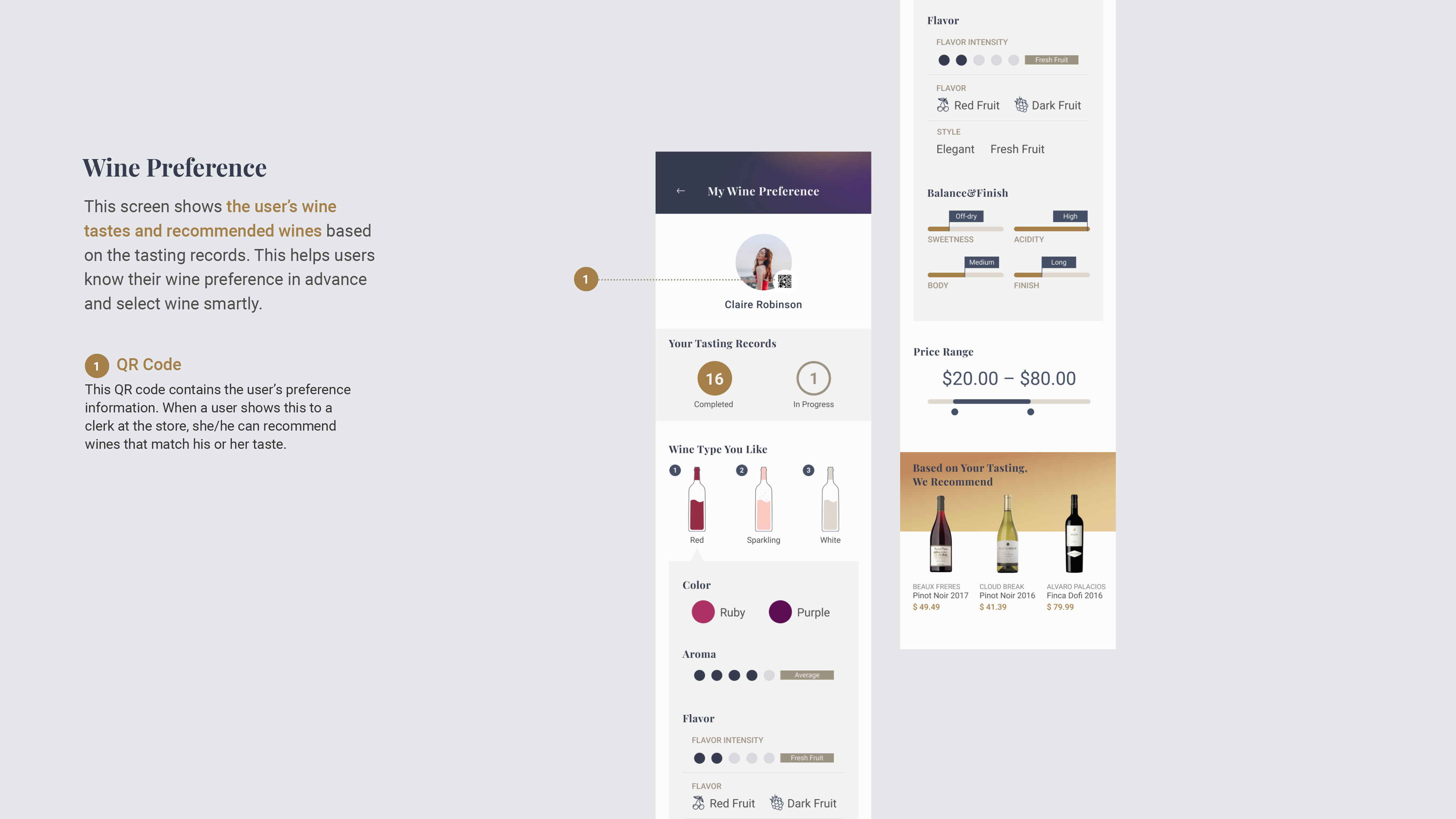
Step 5. Find your wine
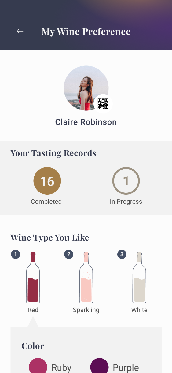
Based on the user's wine tasting record, Wine Sense analyze preference and recommend their perfect wine.
Background
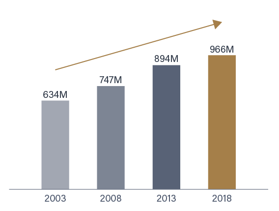
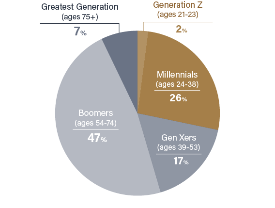
Wine consumption in the United States is on the rise, and 28% of consumers are between the ages of 21 and 38. Considering that they are more familiar with digital content than analog ones, the good quality of digital wine content can help the younger generation consume more wine.
Competitive Analysis
I found three competitive apps related to wine tasting and analyzed them in terms of workflow, information design and presentation method. Here’re my key findings from the research.
- Most of these apps focus on providing information and searching wine, not wine tasting.
- Some of them provide tasting note functions but it's too simple or boring.
- These apps simply save the search history but didn’t provide meaningful information to users.
Persona
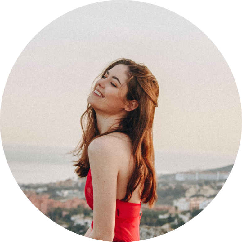
NEW CASUAL TASTER
Claire Robinson
Claire is a college student and just started getting into wines. She enjoys wine with friends and family every weekend. She is currently trying wine tasting whenever she has a chance to find her favorite wine. However, she has some trouble when choosing a wine because she doesn't know what she likes exactly.
User Flows
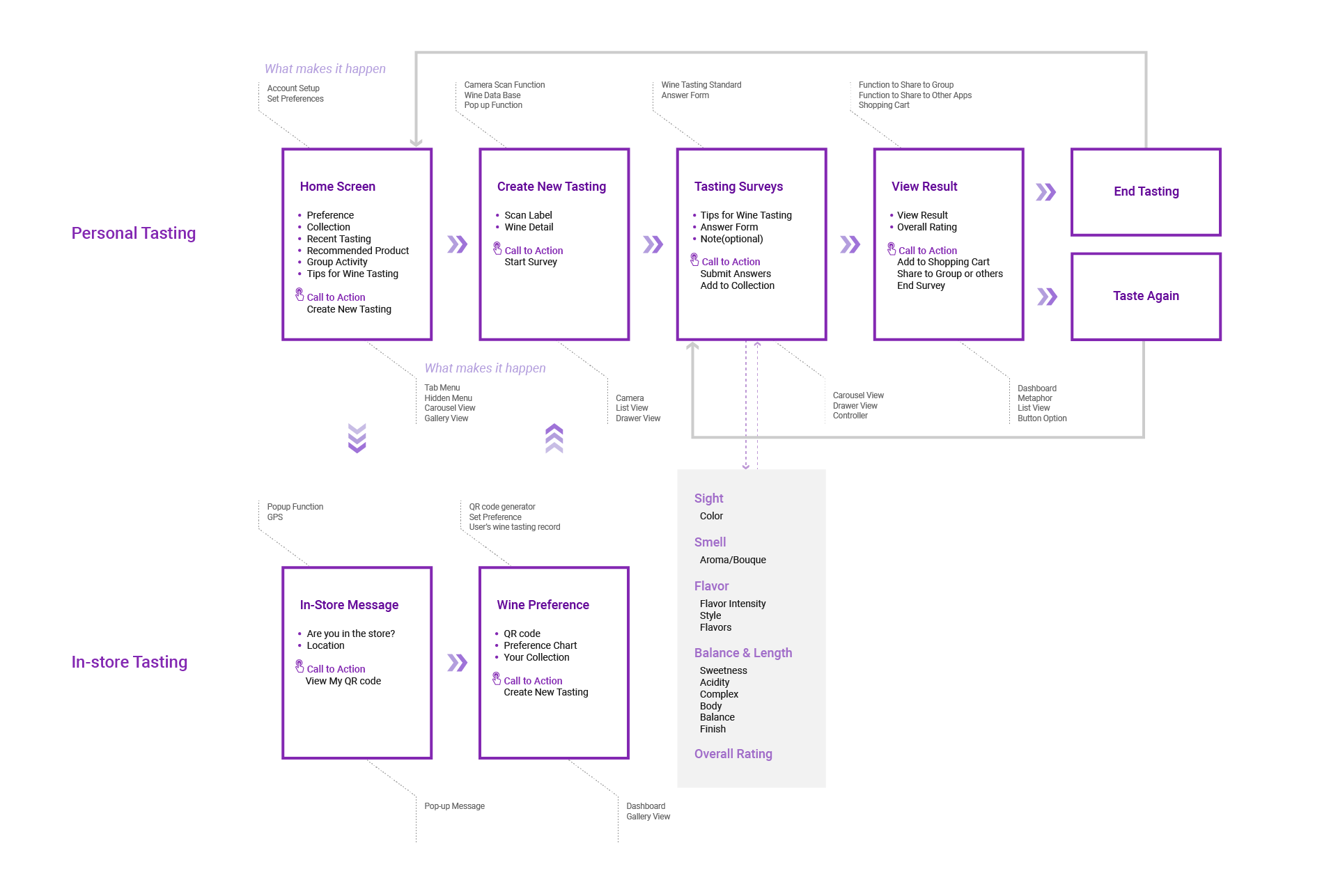
Wine Tasting Flow
The main objective of this flow is to complete the wine tasting and get a meaningful result.
- Users can find the wine they’re going to taste by scanning the label.
- Using the information provided, the user can complete a wine survey.
- The user can take the next positive action based on the wine tasting result.
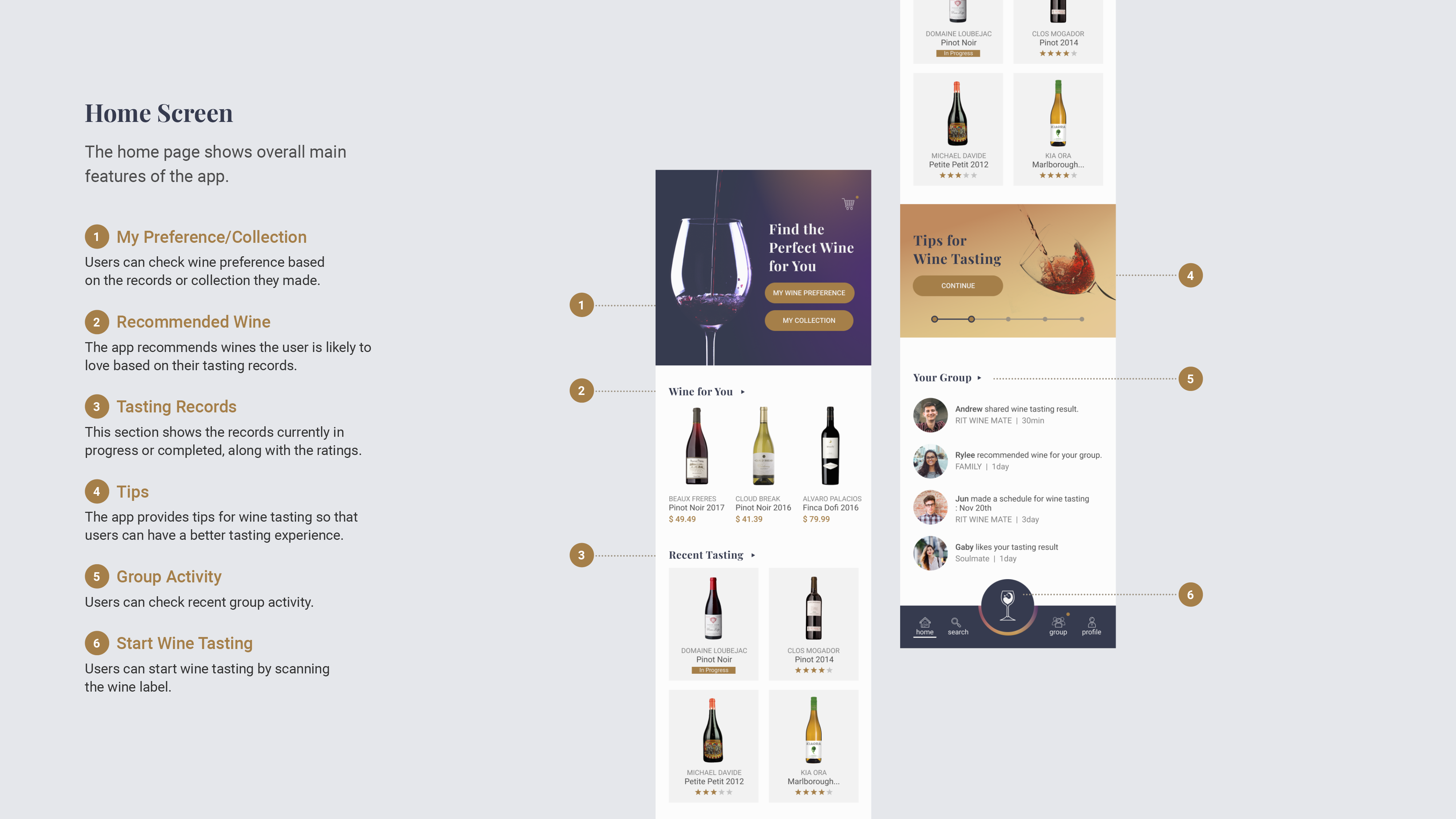
Screen Breakdown
←Swipe the page →
Interaction
Considering that the user holds the wine glass with one hand and uses the app with the other, the app's interaction should be different from the current general wine tasting sheet. To create an effective interaction for the mobile app, I focused on the two points below.
1. Single focus question
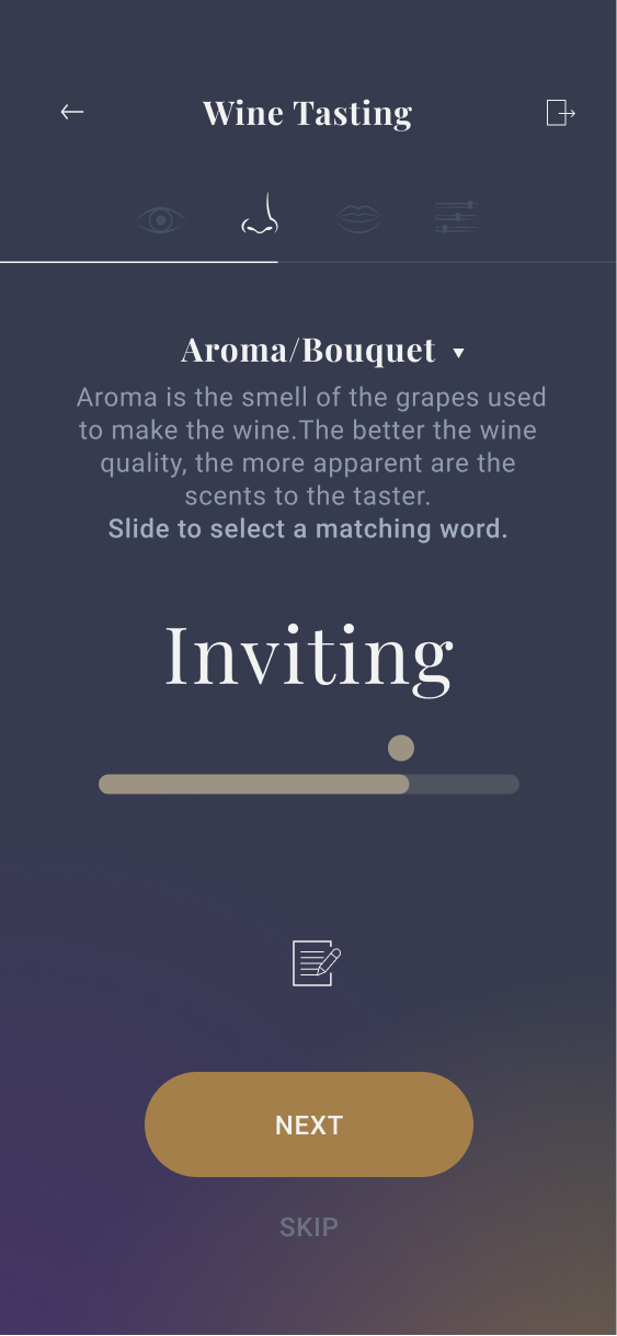
By putting one question for one screen, the app can provide more tasting tips and customized interaction. This allows users to focus on the tasting situation.
2. Interaction based survey
Instead of using a lot of text, Wine Sense uses colors, images and gestures that match the survey question.
Visual Design
Study shows that many people consume wine on a special or celebratory occasion. Wine Sense uses classy colors and typeface to help the user feel the same way while using the app. I got inspiration from the silk illuminated by color light to describe the color and softness of the wine.

Iteration
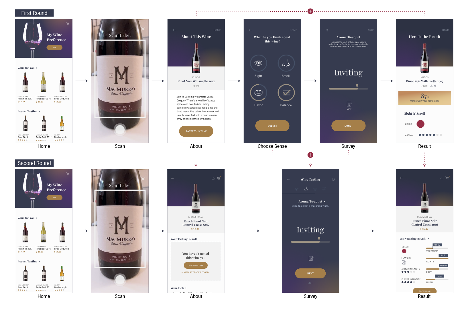
Step 1. Process Reduction
In the first round of design, I realized there were some unnecessary screens and processes in the tasting flow.
- The Sense screen was integrated into the Survey screen so that users don't need to go back and forth.
- The Result screen was deleted and put into the About screen as a section.
Step 2. Data Organization
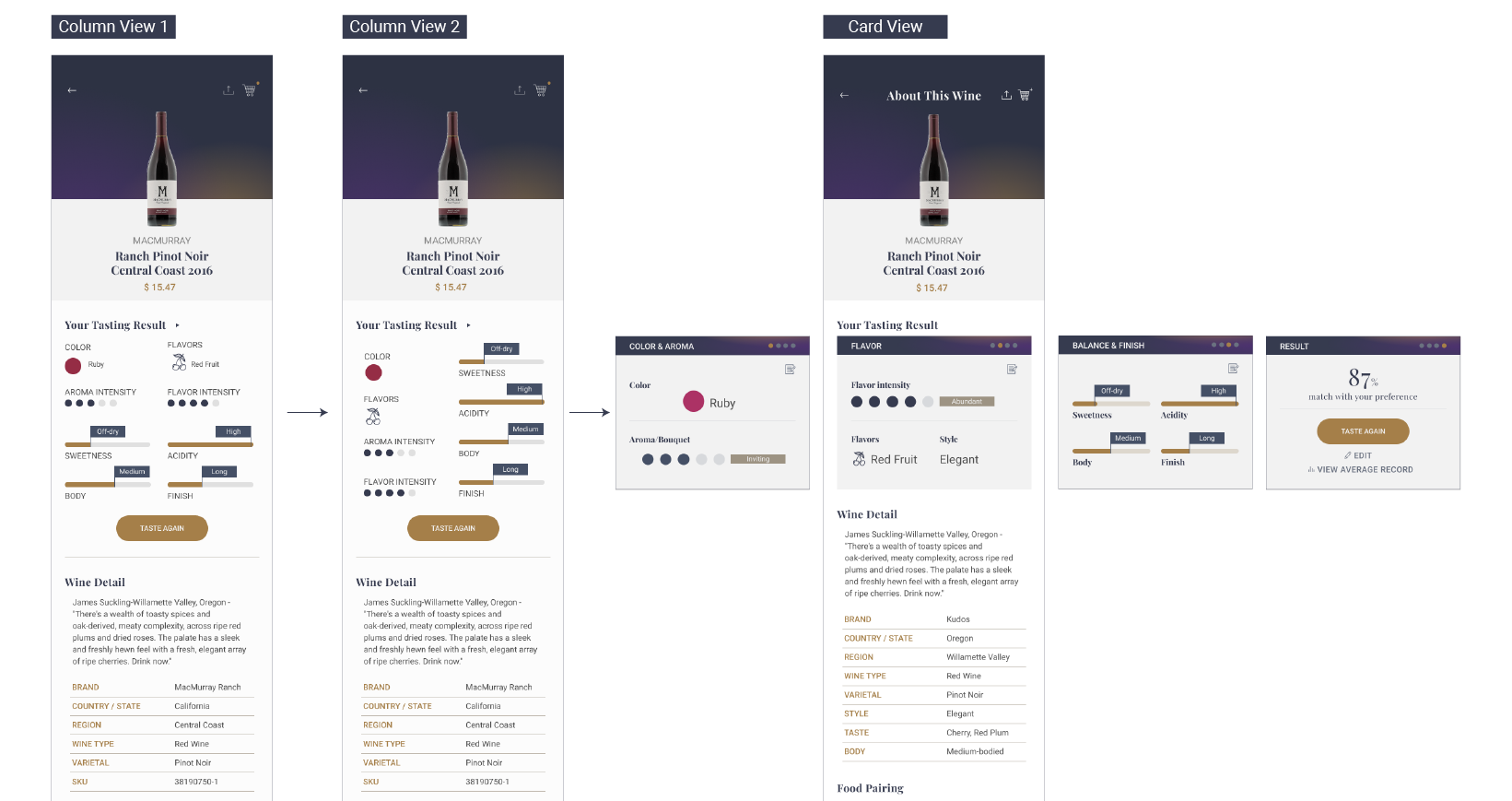
I had to find an effective way to organize the data because the result data put into the About screen as a section.
- It was difficult to organize data in a limited space with a column view.
- The card view is more effective because it can include more data in an organized way and help divide result data from the wine information.
Challenge
Getting quality information
I didn't have much knowledge about wine and there was no one around me who knew it well. Therefore I studied wine tasting and industry with videos and articles and it helped me approach wine tasting from a beginner's point of view.
Designing survey screens
I should put much content(sense bar, question, tip, options and note) intuitively on a single screen without being busy. It was also challenging that I should think about different designs and interactions on each question.
If I had more time...
- I would have studied wine tasting more and improved tips and information more.
- I would have created more survey screens to show more intuitive survey examples.
- I would have conducted a user test to verify the overall flow has worked well.
- I would have improved the Wine Preference screen using the graph.
- I would have created a tutorial animation or video for tips instead of text.
Conclusion
Because wine tastings still don’t leverage digital well, there's a high risk of being forgotten or lost once the event is over. Therefore, each wine tasting survey is likely to become a meaningless record for the user, which prevents users from moving on to a better wine experience.
Wine Sense is an interactive universal survey app that records users' preferences and shares the tasting experience with other users. With Wine Sense, I hope the wine tasting experience will be smarter, more interactive, and enjoyable with others.

Stay in touch
© 2021 Haena Lee

